The Data Handbook
How to use data to improve your customer journey and get better business outcomes in digital sales. Interviews, use cases, and deep-dives.
Get the book
Design system is currently a hot topic. A buzzword like it can have many different definitions depending on who you ask. But what is a design system really about and how can companies benefit from using one?
As Ram mentioned in the first article of the series: “It's only when one peels back the glossy layers of hype that the idea often reveals itself, and is capable of being realised in compelling and visionary ways”. So let’s peel back the layers, shall we?
Why do Design Systems exist?
A Design System exists to bridge the gap between developers, designers and other disciplines. It empowers the company’s culture and ways of working. It is not a documentation, it is a living tool that requires collaborative effort from all stakeholders, and it is everyone’s responsibility to use it, maintain it and iterate it.
Thus it enables better communication between the teams, since they feel empowered to share their work. Together they iterate on the set of components, patterns, and best practices.
In this context:
- Patterns are composed of elements (e.g. buttons, icons, colours, text style), that are used more than one time – repeated – in the interface.
- Patterns are adaptive, since they are reconfigurable depending on the context, and coherent since they are based on familiar elements.
- Practices are how the team chooses to create, use and share those patterns when working in a team.
What a design system means in digital commerce or growth hacking context, is that every stakeholder has access to all available materials at all times, and the means to quickly produce new components such as banners for a marketing campaign, icons for a webstore or a new element for a product's UI.

More over brand guidelines & style guides
Most companies have a brand guideline, which is used to communicate with both internal and external stakeholders. The brand guideline is a documentation aimed at helping to reach consistency in different channels so that the company’s tone-of-voice, vision, and look & feel are experienced in the same way by the end-customer – regardless if the material is produced by external or internal workforce.
The length and content of a brand guideline can vary quite a lot, but in general, a guideline contains at least two important parts: the visual style – or style guide – and the content guide. The thing with every brand guideline is that it needs to be updated to stay fresh. It usually requires a lot of resources, time, and effort to update a static file. Furthermore, it is very hard to make sure that all stakeholders have the most up-to-date version.
Lately, more and more companies have turned to an online version, as it is easier to maintain, update and upload the material – and to communicate those changes to all stakeholders.

Enter the Design System!
What's so great about a design system is that it takes away the pain of building and maintaining a physical brand guide. It also changes the dynamics of collaborating: anyone can add to the brand components by building on the available materials. A design system encourages contributions and creates a culture of sharing.
True collaboration isn’t throwing designs over the wall. It’s designers, engineers, and the rest of the team sharing the responsibility to build a quality product. — Diana Mounter
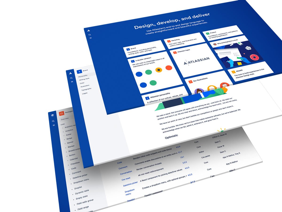
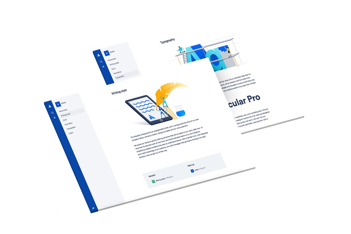
Now, let’s take a look at Atlassian’s design system. The home page contains several links to deep-dive into different topics. The brand is included in the system and is used as a foundation. The marketing section gives a detailed guideline on how to use the brand in marketing materials, as well as brand assets. The product section contains a guideline, components and patterns for building applications. These components and patterns are part of a UI library that was built according to the design guideline.
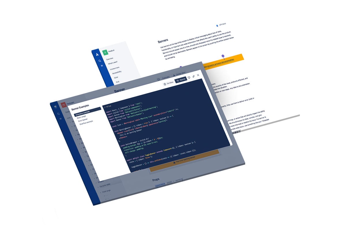
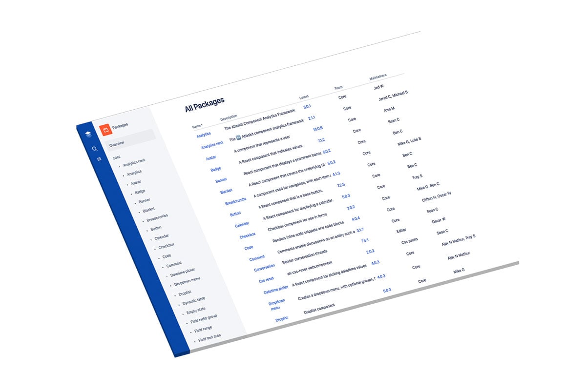
In the picture below you can see a list of all components, who at Atlassian is responsible for maintaining the component, and which version is the latest one. If you click on one specific component, such as banner, you can see documentation for both developers and designers, how it looks visually, and examples of use cases.

Building a Design System is not an easy task. It requires a community who is composed of people with various profiles and roles – and who are committed to maintaining it. It can help designers and developers to work more efficiently because it turns chaos into order. It eliminates miscommunications and enables the team to share the same vocabulary. And because of that, a company is able to quickly make changes and launch new features faster. Also, employees become more efficient as their time is spent on building new components rather than re-building something that someone has already done, which ultimately means more time and better focus on the core business.
This is the second article in a series on Design Systems. Take a look at the other posts too!
3. Design Systems As Drivers for Cultural Change – Case IBM
4. Adventures in Design System Wonderland – Where to Start: Design & Development Perspective
5. Three Tools that Bridge the Gap between Designers and Developers
Source for all images: https://atlassian.design
The Data Handbook
How to use data to improve your customer journey and get better business outcomes in digital sales. Interviews, use cases, and deep-dives.
Get the book