The Data Handbook
How to use data to improve your customer journey and get better business outcomes in digital sales. Interviews, use cases, and deep-dives.
Get the book In our earlier posts in the series we discussed about the idea behind design systems, its provenance and related concepts like style guides; we brought out of the dark some challenges that organisations may face in the implementation and upkeep of them, and of course — the advantages! Now that we're over all that, there is the practical question of where to start. This post is about that.
The Dream Product
Every design system is different. They're built from the ground up or assembled from readily available components depending on the goals of the organisation, the dream product/brand that is being pursued. The first thing to do, the starting point, is to consider that vision. There are a few questions which should be asked at this point:
- What would this system include; is it an overarching design system for the whole organisation or is it something for a specific product or sub-brand?
- Which products or brand touchpoints would primarily benefit from the system; is it only for digital products?
- Can the system make use of existing proprietary or commercial assets?
- How much resources will be allocated to build and maintain it?


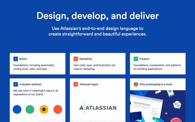
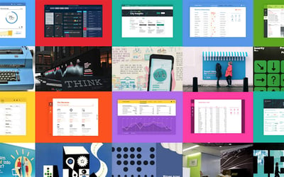
Atlassian’s and IBM’s design systems touch upon almost all aspects of brand experience
If your vision is of a grand system à la IBM which incorporates almost every aspect of the brand and a cultural makeover to go with it, we're assuming you are well prepared and well staffed. It's a remarkable effort, starting with the identification of essential brand virtues which make the brand, and building up from there. If you have the more modest aim of consolidating graphic styles and brand messages without any updates on the software front, perhaps you just need an online style guide. What we would like to focus, here in this series, is on building design systems for digital products or having digital products as a fundamental concern. There are broadly two ways to proceed with this.
To Bootstrap
One of the basic elements of any design system is the typeface or typefaces used. And except for large, large organisations which may run up hefty licensing fees in the long term, very few bother to commission one. There is no reason to. To take this approach to its logical extreme would be to use commercial (or open-source) assets wherever possible, employ similar UI elements and iconography, maintain similar modules with just the right amount of brand differentiation through graphic detailing and copywriting. And there is good reason to — the more surprising interactions you spring at the user, well, they're surprised.
The lazy side of this approach becomes a dull showcase of Wordpress and Bootstrap powered sites with no character or excitement, but there's a significant space of opportunity between that and the header-to-footer bespoke solution. This combination of readily available, well-tested component libraries like Bootstrap with discerning brand-specific style guides and graphics would be a great option for any organisation that is short of budget or time. If you're already on a platform like Shopify or Squarespace, and your best return on investment is through distinctive product photography and other branded content, it might just be the best option.

Some of the components included in Bootstrap 4.
To round up, hack your way into a design system by utilising existing component libraries like Bootstrap if you're short of time or budget, or the benefits of custom interaction patterns and UI elements are insignificant to you or just very distant. With this approach, the component library combines with your brand assets like the logo, palette, typography to give a distinctive tone to a familiar visual language and thus becomes the design system. Advantages include faster time-to-market, perhaps fewer visual bugs and rich documentation. Of course, there are disadvantages.
Not To Bootstrap
Anything as extensively developed and versatile as a pre-existing component library is almost by definition, not designed to your needs. The depth of construction gradually becomes a drag, making modifications difficult and the load unnecessarily heavy. If the product is to become continuously complex, this develops into a scenario where it might start to make sense to redesign the system from scratch or create a heavily customised one from some basic components.
When the product you're setting out to build or re-design involves unique and essential interaction patterns, or if it's part of a more massive branding effort, it absolutely makes sense to consider building a new system first, and utilising existing component libraries second only as a backup option. These libraries are, after all, only a part of the design system and there's no reason to accommodate your plans to their specifications if there's no urgency. Also, if your needs are very simple, it might not make sense to utilise something that would make things complicated. Design systems can be very simple indeed. Brad Frost’s Atomic Design makes a strong argument for more modularity in digital interaction design.
A practical approach could be to build parts of the system later and only have the essential components at the outset. This might even be the sensible approach if you want to test things out with the users and gauge their reaction. Not for all occasions as most B2C online stores, for instance, would be expected to have a level of polish even during pre-launch, but there are cases where this could work to great advantage. Before you start, have a vision, look at the present condition, consider impact vs. effort.
A Developer Speaks
When our company was approached to create a React-based web application — we aimed (as we usually do) to get results for the client as quickly as possible. The best way to learn from what you make is to get it out in the wild and get feedback as soon as possible. So in this project, we turned to React Bootstrap to do exactly that — bootstrap our UI. All it took was a ‘npm install react-bootstrap’, a script tag addition to our index.html file and we were ready to go.
React bootstrap gives you a lot of power immediately out of the gate. You can easily organise your React components into rows and columns, chuck in some of their predefined components and you've got a basic UI up and running in the space of a couple hours.
At this point in time you're seeing React Bootstrap (and other CSS heavy component libraries) for what they do best — quick development when you're willing to let the details slide. If you're at this point in your current project, step away from your computer, take a deep breath, look out the window, smile, and realise it's all downhill from here.
Let’s have a quick look at an example.
Say we want to create a carousel of images. Bootstrap has you covered on this one, and you can create one in just a few lines of code.
See on GitHub.
And that's it! We just import the Carousel component, define each item and magically a carousel appears. We can present this to our client and everyone will be happy with the progress we've made. However, as our web app moves from "prototype" to "MVP" we want to ensure that we're keeping as close to the designs as possible. We've discovered that the shadow on the carousel component on our navigation bars is a bit too strong, so we want to tone that down a little bit. No worries — let’s open the dev tools and have a feel around.
We can see here that Bootstrap is overriding its own CSS already, and the approach that we're going to take to solve this is by overriding that with our own CSS. This very quickly becomes a common trend when working with CSS heavy component libraries such as this — you will need to override already over-complicated CSS to migrate away from a style guide that you didn't have much interest in sticking with in the first place.
Like with everything, there's a trade-off that you make here. There is a huge ease of development to get something up and running, but this can very quickly come back to haunt you. This is especially the case if you're creating a very custom style-heavy UI.
I would love nothing more than to say "this is the golden rule to avoid fighting CSS that you weren't that invested in in the first place" but that simply doesn't exist. The best advice I can give is to consider your case carefully. Do you want to get up and running quickly? Are you willing to take the technical debt in order to generate immediate results? Or do you have more time to lay a solid foundation (i.e. build everything from scratch)? Or maybe you see that your application or ecommerce store will be complex, and so will have a complex style guide to match?
By far, the most important part of this is to ask these questions. Consider the scope of what you're working on, the benefits and drawbacks of each approach and you can take comfort in the fact that you're making a well-informed decision.
The Grand Realisation
It's complicated. There's no ideal way to a design system for digital products but there are shortcuts. In many cases, we're referring to extending an (incomplete) design system already in use, like brand guidelines, to applications, webstores and other digital touchpoints, and this could benefit from readily available component libraries if the needs are moderate. If they're very ambitious or very simple it's probably time for a new one that the world hasn't seen yet. Don't hesitate: it could turn out to be so inspiring that you might want to make it public and inspire others.
Special thanks to Rory How for dropping in with his keen front-end development perspective. See his other posts here.
This is the fourth article in a series on Design Systems. Take a look at the other posts too!
2. Design System - What Is It and What It Means to Have One
3. Design Systems As Drivers for Cultural Change – Case IBM
5. Three Tools that Bridge the Gap between Designers and Developers
The Data Handbook
How to use data to improve your customer journey and get better business outcomes in digital sales. Interviews, use cases, and deep-dives.
Get the book


