The Data Handbook
How to use data to improve your customer journey and get better business outcomes in digital sales. Interviews, use cases, and deep-dives.
Get the book
Earlier in the year we attended a Google event in Stockholm headlining Lina Hansson, Conversion specialist, who shared useful tips for better mobile design for ecommerce. Here is a fully packed blog post with plenty of learnings and hands-on improvements you can do to upgrade your digital mobile experience to drive more growth.
In this first part, we will focus on speed, conversion, and usability tests.
How to increase online sales
In the big picture, we believe it’s all about finding a balance. You can’t only look at the numbers, data or one side of the funnel. You can’t concentrate only on the design or customers. Everything needs to fit together, and processes as well as functions need to be tied to their purpose.
First of all, look at the data. What does it tell you? Has it been set up right for your business? From the numbers, a set of questions and goals should arise. What are your goals? What is your north star KPI that is most important for you this year?
It’s key to ask for feedback for everything, all the time. Establish a close connection to your customers, they are your safest bet for finding the right points to improve and to drive more growth. Remember to do both qualitative and quantitative analysis. Qualitative data is the biggest missed opportunity simply because we are afraid to ask what people think. Dare to take this step and ask for opinions. Most likely, you will get valuable ideas that are worth testing.
When you identify challenges in your business, brainstorm and be creative to find solutions. When you have addressed the bottlenecks of the affected areas, go back to the results, evaluate and then start again.
When companies decide to redesign their website, too often they seek help from trendy design agencies in the belief that a new website design will solve all problems. Having a brand new design that makes everyone go “wow” might seem like an easy option, but what happens when you haven’t tested your ideas and conversion rates go down because the changes weren’t built based on data? Your website becomes an expensive investment that doesn’t perform according to your expectations, and if you have used up your budget you might be stuck with it for a while.
A few questions to ask yourself
- How do we make life better or easier for our customers?
- Is the UX great? (all parts of it)
- How do we take in feedback from users?
The Process of CRO (according to Google)
First of all, what is CRO (conversion rate optimisation)? One definition is that it’s the process of testing what works for customers, with the help of customers.
The process could look like this
- Do quantitative and qualitative research, as well as heuristic research and evaluation
- Find a list of weak spots and bottlenecks. (you should celebrate finding these weak spots, this simply means that you have found something that you can improve)
- Do your hypothesis
- Run A/B tests and run your experiments
- Evaluate the tests, grow or kill the ideas. Iterate and start new tests.
And so the loop goes on. This is something that should always be ongoing and not just a one-off event. Today, the biggest AB testers out there are Google, Amazon, Booking.com, and Spotify. These companies conduct hundreds of AB tests every day. Yes, every day. And these are automated.
Downloadable cheat sheet for CRO

About mobile usage
Mobile usage continues to rise worldwide. In Asia, many don’t even have a laptop and go straight to mobile instead of having a second device.
“93% of transactions on singles day on Alibaba in 2017 came from mobile.”
(source: Google event)
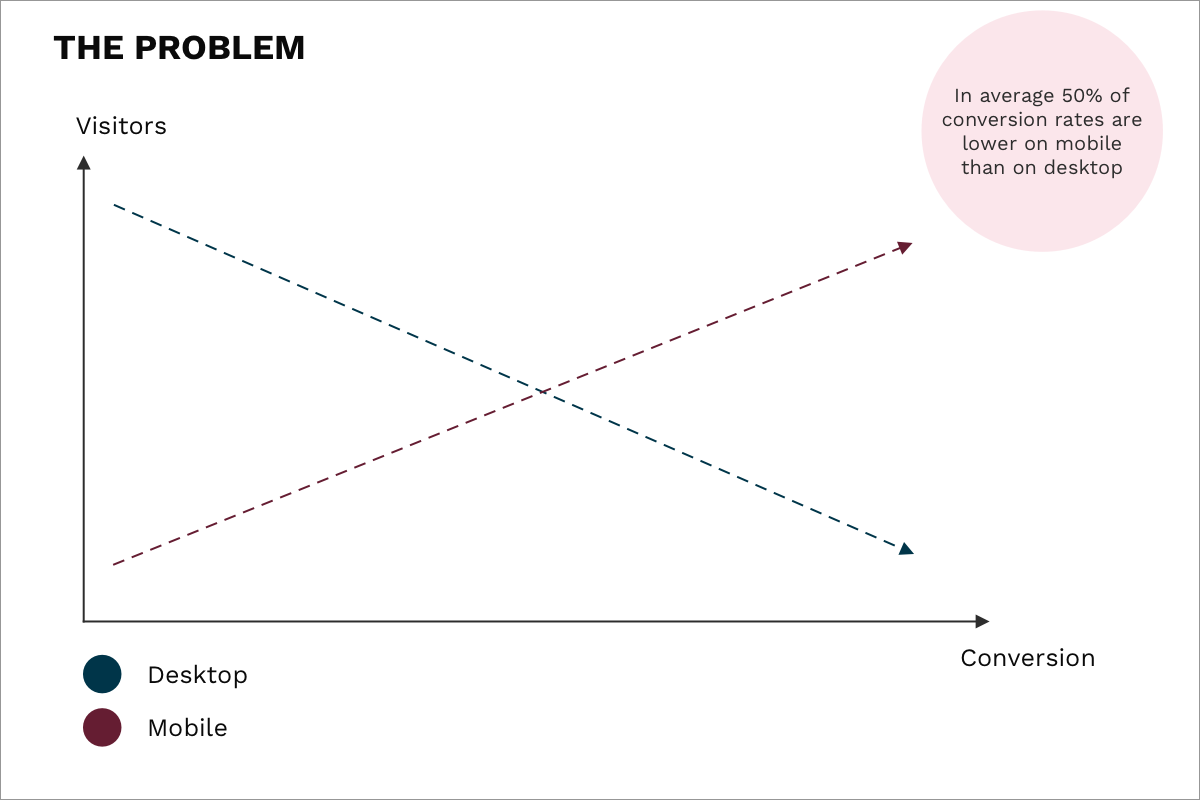
In Sweden, desktop usage is quite high compared to other countries. What’s problematic is that the conversion rate often is 50% lower on mobile vs. desktop. This is something we often see at our clients. Why is it so much lower? Usually because it isn’t optimised.
It’s a typical pattern to start browsing a shop on mobile, but due to passable user experience, to switch to desktop when going through the purchasing funnel because it feels easier and more secure. But it doesn’t have to be this way. Most people spend a large part of their days on their mobile devices. Therefore, if you could increase the conversion rate on mobile, your web store’s growth would be more rapid and it would drive more revenue. So how do you excel in mobile? The answer is simple: speed and mobile design.
If you have an international web store, you can’t just optimise for Sweden or Finland. Consider the internet speed: 4G works better than great in Sweden as well as Finland, but in the UK and Germany things can be quite different. Even if the connection is 4G on the carrier, it can be very slow. The same applies for national differences. The internet is not the same in the far North as in the capital.
So reconsider those large images, heavy carousels and heavy non-optimised sites. Your website needs to be optimised for 3G usage, not the 100-200MB/s that we are used to in our office spaces.
What about the size of the website? You should aim for a site size smaller than 1MB or 1,5MB. Most sites today are around 3MB in size, which takes about 20 seconds to load, which is a long time. Ideally, you want your site to load in less than 3 seconds.
Google’s audit test results on mobile speed
- Lindex = 40 seconds
- Sportamore = 26 seconds
- Most sites = 20 seconds
- H&M = 12 seconds
- Adlibris = 20 seconds
- Amazon.co.uk = 6 seconds
- Etsy = 7 seconds
- Apple = 6 seconds
Since July 2018, Google has also changed its algorithm in search ranking to take into account the page loading time, which is increasingly important for organic mobile searches.
How long does it take for your site to load on mobile? There are many options for testing, but here is one alternative for you to find out for yourself. Test your site here.
How to get great at speed = Make speed a KPI
Few things you can do to increase speed
- Optimise the code (developer team)
- Work with performance (creative team)
- Use tech innovations (developer team)
Downloadable cheat sheet for mobile speed guide
Traditional web browsing vs. new behaviour

When it comes to mobile versions of websites, we are accustomed to repeating the design and layout of the desktop versions, although the reality is that we don’t browse the same way on mobile. We are used to having logos to the left and product categories on the top. So what happens when we cramp everything into a hamburger menu?
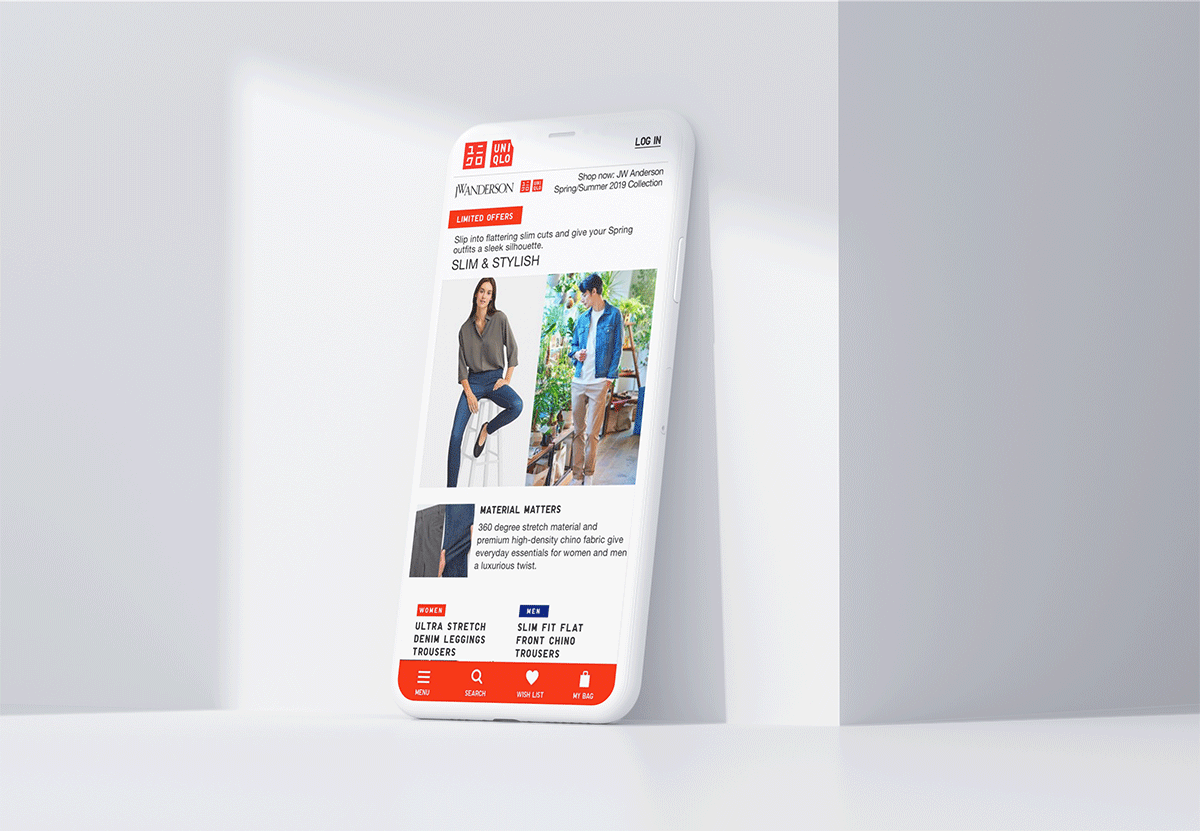
Mobile use is still growing and mobile behaviour is changing. Traditionally navigation is at the top, but more and more sites have started to experiment and have the navigation somewhere else. At the bottom, or even on the side, as Uniqlo for example. Logically, it would make more sense to have the menu closer to the thumb, hence making it easier to reach (and yes, navigation behaviour can be differing on desktop and on mobile on the same site).
How to do good usability tests
Let’s put one thing straight. A usability test is not the same thing as a content test, or testing the brand, message etc. Anyone can do a usability test, preferably someone who doesn’t know your service or products. The test is about the usability of your site. If you wish to test content and such, these should be in your target group and identified as one of your buying personas.
Guidelines for a good usability test
- Give specific assignments and don’t explain everything, the test is for them to find out.
- Ask them to be honest, not polite.
- Record the session (use the screen recorder function on IOS or DU recorder on Android). You can ask them to record whilst they are talking for example.
- Ideally, you want to run 5 usability tests per month.
- List outcomes, likes, dislikes, ideas and problems encountered.
Boom! There you have your initial growth backlog to work on.
Being great in Digital Commerce is about daring to test new things all the time. It’s about tweaking, experimenting, understanding the full conversion flow and getting teams to work together. After all, your customers don’t see the silos of teams when they interact with your shop, but only the end product of their efforts.
Keen on learning more on growth hacking? Download your copy of the popular growth hacking canvas and start growth activities already today!
The Data Handbook
How to use data to improve your customer journey and get better business outcomes in digital sales. Interviews, use cases, and deep-dives.
Get the book


